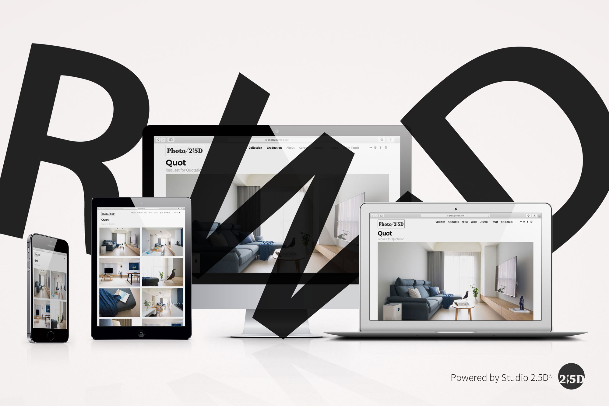
Customise Consent Preferences

We use cookies to help you navigate efficiently and perform certain functions. You will find detailed information about all cookies under each consent category below.

The cookies that are categorised as "Necessary" are stored on your browser as they are essential for enabling the basic functionalities of the site. ... 

Always Active

Necessary cookies are required to enable the basic features of this site, such as providing secure log-in or adjusting your consent preferences. These cookies do not store any personally identifiable data.

No cookies to display.

Functional cookies help perform certain functionalities like sharing the content of the website on social media platforms, collecting feedback, and other third-party features.

No cookies to display.

Analytical cookies are used to understand how visitors interact with the website. These cookies help provide information on metrics such as the number of visitors, bounce rate, traffic source, etc.

No cookies to display.

Performance cookies are used to understand and analyse the key performance indexes of the website which helps in delivering a better user experience for the visitors.

No cookies to display.

Advertisement cookies are used to provide visitors with customised advertisements based on the pages you visited previously and to analyse the effectiveness of the ad campaigns.

No cookies to display.

台北專業RWD網頁設計,2.5D品牌顧問,獨家結合攝影,商標設計的RWD網頁設計公司推薦,響應式網頁設計,SEO網頁RWD設計與RWD品牌形象網頁設計服務,10年經驗建置RWD形象網站,設計公司官網,致電報價。不止是網頁設計公司,台北網頁設計 • 2.5D品牌顧問提供完整的品牌行銷解決方案,為您的自營品牌推薦建構SEO事業網站設計、公司網站型錄與網頁訂購單 ;我們專研於網頁設計美學與網站設計時尚眼光,注重網頁設計UX/UI使用者偏好傳達RWD網頁設計。擅用數位網頁設計的內容質感表現,用心嚴謹的為您的事業網頁設計數位行銷達到誠意與零距離設計,公司都需要設計建置網站與數位行銷,我們為您建構不同一般的行銷經驗。

什麼是[RWD] :響應式網頁設計?

( 文 / 網頁設計公司 • 2.5D品牌顧問 )

自從行動與觸控裝置風行以來,RWD(Responsive Web Design / 響應式網頁設計)成為各種網路應用新媒體必備的規格,雖然RWD(響應式網頁設計)早是一個通用的網路與電子的媒體重要格式之ㄧ,但是現今為數不少的事業網站尚未採用,以下介紹帶您更加認識RWD(響應式網頁設計)的特性…
2011年由美國程式設計師Ethan Marcotte發表RWD(響應式網頁設計)的觀念,也稱為:回應式網頁設計、對應式網頁設計。在2012年RWD(響應式網頁設計)在美國.net雜誌榮登第2名網頁設計趨勢,顯見這個設計模式的重要性。

RWD(響應式網頁設計)有以下特色:
讓裝置使用者在不同解析度的裝置瀏覽同一網站時,展示較佳的排版觀看狀態(包含文字、圖片與影片的尺吋與編排篇幅),讓使用者不需要縮放、拖移、滾動捲軸,繼續順暢瀏覽不放棄。
以下是google行動裝置友善設計的指導建議:

2019年行動裝置的廣泛被使用由BrowserStack所發佈的數據可以得知:

1. 2019年,將近60%的總互聯網瀏覽是發生在手機上。
2. 手機推動了電子商務總收入的50%。
3. 使用智能手機的成年人總數為77%。
4. 94%的上網訪問者根據特定網站的響應度來判斷使用網站傾向。


事業網站為何需要建立RWD(響應式網頁設計)?建立RWD(響應式網頁設計)掌握以下特色與原則:

1.設定Viewport(視窗口):

設定Viewport(視窗口)可以讓瀏覽器判定並控制視窗長度、寬度與起始視窗比例,需在首頁index.html作程式製定,參考以下語法:

<meta name="viewport" content="width=device-width, initial-scale=1.0">


2. 使用css 設定圖片寬度比例:

需在css作程式製定圖片寬度比例,參考以下語法:

<img src="image.jpg" style="width:100%;">


3. 使用響應式字型大小設定Responsive Text Size:

響應式字型大小設定,參考以下語法:

<h1 style="font-size:10vw">Hello World</h1> 

1ovw代表viewport的10%


4.參考Bootstrap來制定響應式網站框架:

Bootstrap提供多種響應式框架範例供程式設計師研究與發展動態多媒體網站

2.5D 品牌顧問為客戶開發網站皆採響應式網頁規格設計。

RWD網頁設計,響應式網站設計,RWD網站設計,響應式網頁設計